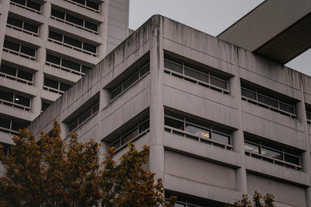
Not too long ago, you could look around the metropolitan region and lament the absence of color in new buildings. It seemed as if everything being built was some version of grayness. Tan and beige tones were the standard go-to hues as the 1990s came to an end.
Large expanses of glass often reflected (sometimes literally) the sky — looking like a uniform, fluorescently lighted ceiling. Each new building appeared to extend this limited palette with more walls of pale boredom.
That was before the 2000 completion of the Museum of Pop Culture — or MoPOP — the former Experience Music Project. Whether or not one considers it a top-drawer example of architect Frank Gehry’s prolific body of international work, the structure created a definite splash on the local scene.
Perhaps it broke the unwritten rule of architectural discretion through the application of vivid colors, as well as sinuous shapes. It just took a while for the regime change to fully occur.
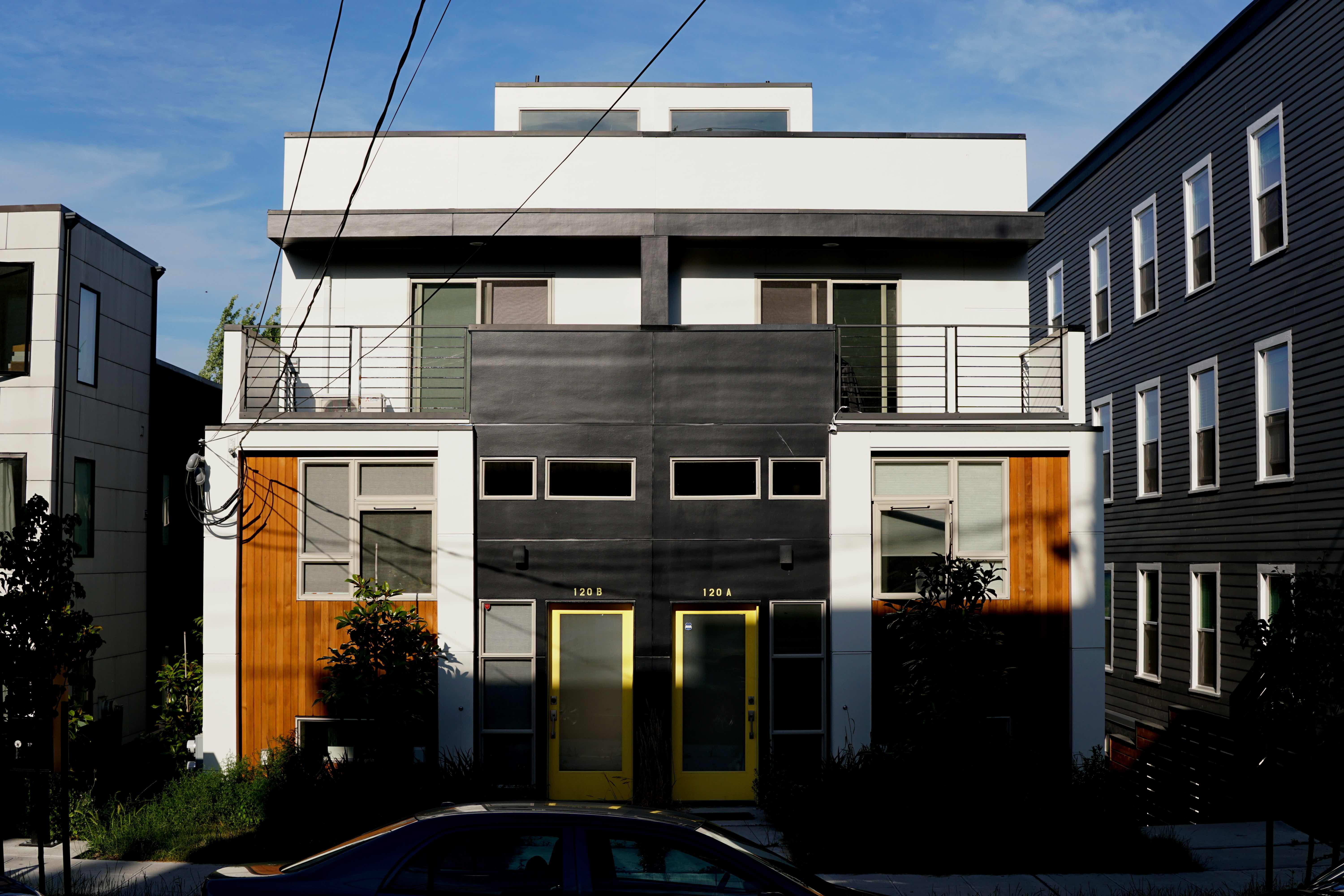
As we emerged from the long stretch of depressing weather that broke records from November onward, we saw that something quite interesting had happened almost without anyone in Seattle expecting it. With scaffolding and protective tarps taken down around construction, we found ourselves seeing colors. Lots of them.

Along Dexter Avenue, Stone Way, Madison, Seneca and other streets throughout the city, many new buildings have been enlivened by intense colors. And not just token swatches or trim but broad brush strokes that cover large portions of the exteriors.
In previous years, a handful of designers played with colors. But the attempts were tentative and subtle. Perhaps a series of projecting bays were finished in mustard yellow. But not much more.
Likely, the reticence was the result of development clients being fearful of making a “wrong” choice in the marketplace — safer to stay with muted color scheme.
Moreover, the specification of colors can be fraught with hazards. What might look good on a small sample or in a simulated rendering could turn out quite different in the full-scale presentation. And, by then, of course, the work has been bought and paid for.
Some of the past reluctance to add color to architecture might have come from the region’s roots in Scandinavia, where politeness and deference is often the cultural norm. But for decades, buildings in Scandinavian countries have used intense colors to create a unique ambience in spite of their more adverse climates. For whatever reason, Seattle has come late to the game.
But now, color is on us almost with a vengeance. Even temporary construction enclosures on high rises are showing up with bright yellows and blues. The increasing verticality of the city is being celebrated by these rising collars of color.
And color has come to us not just in flat-painted surfaces. It has been infused in glass. The clutch of towers for Amazon around Seventh Avenue and Lenora Street fairly bristle with blades of colorful glass. Light passing through them produces different effects depending on sun angle and sky atmospheric conditions, as well as with ambient light in the evening. We are seeing a wholesale playfulness in infusing the skyline with combinations of color.
Asked about this seemingly sudden change, architect Ed Weinstein of Weinstein EU attributes the change to the economic recovery, which has given us “a new exuberance of architectural form and color which seeks to create a new identity and expression.” John Savo, architect and principal with NBBJ, cites the arrival of the many new companies that are “multicultural organizations … looking for their environment to express their difference, their creativity and their energy.” He explains that many of those cultures embrace color in buildings.
Not all aspects of the dramatic changes we have recently seen in Seattle have been universally embraced. In some quarters, there is a continuing fear of density and the dominance of a few corporate empires.
But despite a collective angst, we are seeing a whole new attitude toward buildings that are considerably — and refreshingly — more expressive and colorful than we have ever seen in the past.